
Traveloka's transport offering, specifically the Car Rental and Airport Transfer (CARS) products, has not achieved the expected conversion rates or transaction volumes. Research indicates that many Traveloka users are still unaware of these services, often perceiving Traveloka solely as a platform for booking flights and hotels.
The design challenge in this project involves increasing user awareness and improving the Perception of Availability (PoA) for the CARS products, ensuring this enhancement does not detract from the performance of core products. Additionally, the project aims to streamline the process for users already aware of the CARS product, allowing them to easily and intuitively access these services through existing Traveloka channels.
Using a diegetic approach, our team acted in several different roles to participate in excitedly welcoming and celebrating the return of these endangered species.
Traveloka is Southeast Asia’s travel and lifestyle app that provides its customers with access to discover and purchase different types of travel needs. Its product portfolio includes transport booking services such as flight tickets, buses, trains, car rentals, airport transfers, and access to SEA's largest accommodation inventory. By the time I worked on this project Traveloka had about 40 million monthly active users across Southeast Asia.
Transforming user perceptions through strategic redesign, we enhanced Traveloka's service discoverability, proving that clear communication and intuitive design can significantly uplift user engagement and conversion rates.
Remote user research using Sacrificial Concept
At the outset of this project, I initiated stakeholder interviews and competitive benchmarking to gain relevant context. Subsequently, with assistance from a UI Visual Designer, I developed sacrificial concepts and interactive prototypes for in-depth interviews with users of the car rental and airport transfer services. We recruited 2 participant groups based on their familiarity with Traveloka's services: The "Regulars," who are familiar with the products, and The "Newbies," who were unaware of these services. All interviews were conducted remotely via video call, with prototype links sent to participants beforehand.
Key areas of focus during the interviews included:
Insights Sharing & Design Critique With Stakeholders
During the interviews, we found that the sacrificial concept effectively improved the Perception of Availability (PoA) and enhanced Discoverability and Findability for Car Rental and private car Airport Transfers among participants previously unaware of these options. However, the concept did not extend well to Airport Trains and Buses, which participants found difficult to locate.
We also uncovered a mismatch between user expectations and Traveloka's service categorization. Users expect to find transport options grouped by vehicle type—private cars under CARS and Airport Trains under Trains—differing from Traveloka's current organization.


The sacrificial concept which combines the Car Rental and Airport Transfer products entry point which were previously two separate product icons (top left image) into one product icon called “Cars” (bottom left image) and a new Search Form flow (see animation)
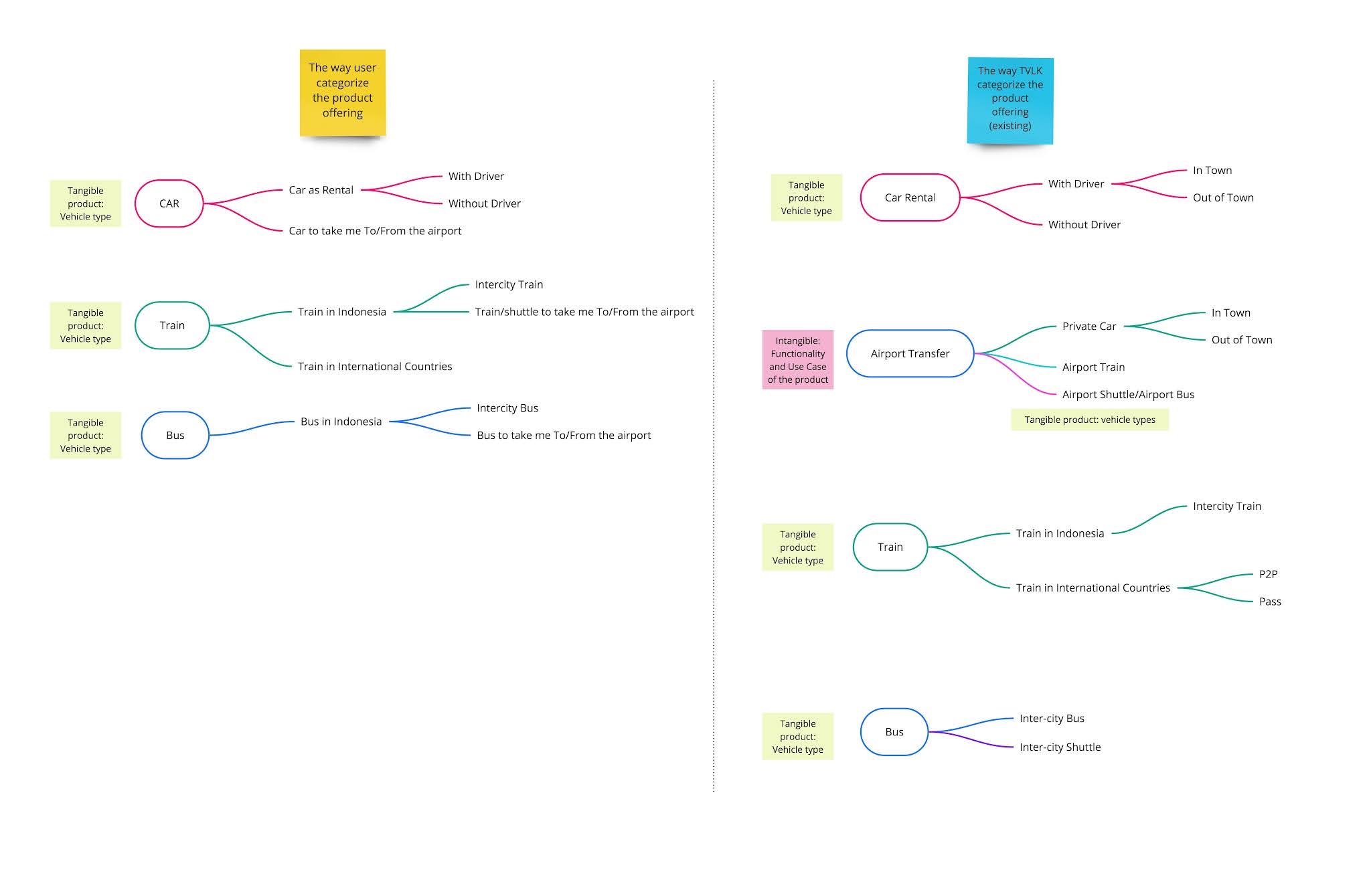
From the user research we learned that We also learned that there’s a discrepancy between the way people group/categorize transportation means and the way Traveloka structures the product offerings. The user groups transportation means based on the vehicle type, for example, they would think that they will find four-wheeled private car inside CARS entry point, and find Airport Train inside Train entry point.
Design Principles
Based on insights from our sessions and critiques, I realized that the project's outcomes would impact not just Cars products but all Ground Transport offerings. Consequently, I developed design principles that informed the redesign of entry points and the Homepage, ensuring these changes could be applied to other Ground Transport products and improve how we communicate our overall product offerings.
Product conceptualization and remote usability testing
I proposed restructuring the product and sub-product groupings to align more closely with how users categorize information, starting with the most tangible category, the vehicle type, followed by less tangible categories. Based on these design principles and the revised information structure, I collaborated with the UI Visual Designer to create a new design that reorganized Ground Transport products by vehicle type. We then conducted remote usability testing on this new design and made necessary iterations. We also had to do a socialization on the changes we proposed to all the teams in Ground Transport business

The design principle that we used to guide the new design and information architecture


From the user research we learned that We also learned that there’s a discrepancy between the way people group/categorize transportation means and the way Traveloka structures the product offerings. The user groups transportation means based on the vehicle type, for example, they would think that they will find four-wheeled private car inside CARS entry point, and find Airport Train inside Train entry point.


This shows a comparison between the previous design (top image) and the new design (bottom image) in which we reorganized Ground Transport products by vehicle type. We then conducted remote usability testing on this new design and made necessary iterations.
Navigating the complexities of user behavior and stakeholder expectations, this project was a testament to the impact of thoughtful design on product success and customer satisfaction.
Outcomes
The design process was completed in early June 2020. For the rollout, we planned A/B testing and a phased release for each product (Cars, Bus, and Train) from September to October 2020. With the product manager, I discussed the versions to release and the success metrics with the data scientist.
The options were:
The results of the A/B Testing conducted in Sept - October 2020 were quite promising. The visit to Issuance conversion rate for the new design is higher than the old design scenario. The team then released the new design in Traveloka App version 3.28
Learnings
From this project, I gained several key learnings: